First, import your libraries!
import pandas as pd
import numpy as np
from sklearn.model_selection import train_test_split
from sklearn.neighbors import KNeighborsClassifier
from matplotlib import pyplot as plt
Data prep
Based on the following data summary, what questions and business metric should we use?
bank_data = pd.read_csv("https://raw.githubusercontent.com/UVADS/DS-3001/main/data/bank.csv")
bank_data.info()
<class 'pandas.core.frame.DataFrame'>
RangeIndex: 43628 entries, 0 to 43627
Data columns (total 14 columns):
# Column Non-Null Count Dtype
--- ------ -------------- -----
0 age 43628 non-null int64
1 job 43628 non-null object
2 marital 43628 non-null object
3 education 43628 non-null object
4 default 43628 non-null object
5 balance 43628 non-null int64
6 housing 43628 non-null object
7 contact 43628 non-null object
8 duration 43628 non-null int64
9 campaign 43628 non-null int64
10 pdays 43628 non-null int64
11 previous 43628 non-null int64
12 poutcome 43628 non-null object
13 signed up 43628 non-null int64
dtypes: int64(7), object(7)
memory usage: 4.7+ MB
< your answer here >
Now, let’s check the composition of the data.
bank_data.marital.value_counts() # 3 levelsmarried 26241
single 12355
divorced 5032
Name: marital, dtype: int64bank_data.education.value_counts() # 4 levelssecondary 22404
tertiary 12863
primary 6584
unknown 1777
Name: education, dtype: int64bank_data.default.value_counts() # 2 levelsno 42844
yes 784
Name: default, dtype: int64bank_data.job.value_counts() # 12 levels! What should we do?blue-collar 9366
management 9142
technician 7321
admin. 5001
services 4010
retired 2184
self-employed 1530
entrepreneur 1433
unemployed 1259
housemaid 1199
student 907
unknown 276
Name: job, dtype: int64bank_data.contact.value_counts() # 3 levels -- difference between cellular and telephone?cellular 28295
unknown 12523
telephone 2810
Name: contact, dtype: int64bank_data.housing.value_counts() # 2 levelsyes 24231
no 19397
Name: housing, dtype: int64bank_data.poutcome.value_counts() # 4 levelsunknown 35684
failure 4723
other 1783
success 1438
Name: poutcome, dtype: int64bank_data['signed up'].value_counts() # 2 levels0 38554
1 5074
Name: signed up, dtype: int64We should collapse the variable with 12 levels. In Python, this process is slightly different than it is in R.
employed = ['admin', 'blue-collar', 'entrepreneur', 'housemaid', 'management',
           'self-employed', 'services', 'technician']
# unemployed = ['student', 'unemployed', 'unknown']
bank_data.job = bank_data.job.apply(lambda x: "Employed" if x in employed else "Unemployed")
bank_data.job.value_counts()
Employed 34001
Unemployed 9627
Name: job, dtype: int64Now, we convert the appropriate columns to factors.
# bank_data.info()   # check the variables
cat = ['job', 'marital', 'education', 'default', 'housing', 'contact',
      'poutcome', 'signed up']   # select the columns to convert
bank_data[cat] = bank_data[cat].astype('category')
bank_data.info()
<class 'pandas.core.frame.DataFrame'>
RangeIndex: 43628 entries, 0 to 43627
Data columns (total 14 columns):
# Column Non-Null Count Dtype
--- ------ -------------- -----
0 age 43628 non-null int64
1 job 43628 non-null category
2 marital 43628 non-null category
3 education 43628 non-null category
4 default 43628 non-null category
5 balance 43628 non-null int64
6 housing 43628 non-null category
7 contact 43628 non-null category
8 duration 43628 non-null int64
9 campaign 43628 non-null int64
10 pdays 43628 non-null int64
11 previous 43628 non-null int64
12 poutcome 43628 non-null category
13 signed up 43628 non-null category
dtypes: category(8), int64(6)
memory usage: 2.3 MB
Check for missing data
R uses the mice package, which allows you to visualize the NaNs in a dataset and later impute it. There is no equivalent package in Python, but we can still complete the same steps.
Using the seaborn package, we can see the distribution of missing values. Along the x-axis, you will see the proportion of the data missing for that variable.
import seaborn as sns
sns.displot(
    data=bank_data.isna().melt(value_name="missing"),
    y="variable",
    hue="missing",
    multiple="fill",
    aspect=1.25
)
# plt.savefig("visualizing_missing_data_with_barplot_Seaborn_distplot.png", dpi=100)
# the above line will same the image to your computer!
<seaborn.axisgrid.FacetGrid at 0x7fd15aec46a0>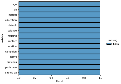
No missing data!!
Next, we normalize the numeric variables.
numeric_cols = bank_data.select_dtypes(include='int64').columns
print(numeric_cols)
Index(['age', 'balance', 'duration', 'campaign', 'pdays', 'previous'], dtype='object')
from sklearn import preprocessing
scaler = preprocessing.MinMaxScaler()
d = scaler.fit_transform(bank_data[numeric_cols])   # conduct data transformation
scaled_df = pd.DataFrame(d, columns=numeric_cols)   # convert back to pd df; transformation converts to array
bank_data[numeric_cols] = scaled_df   # put data back into the main df
bank_data.describe() # as we can see, the data is now normalized!Now, we onehot encode the data -- for reference, this is the process of converting categorical variables to a usable form for a machine learning algorithm.
cat_cols = bank_data.select_dtypes(include='category').columns
print(cat_cols)
Index(['job', 'marital', 'education', 'default', 'housing', 'contact',
'poutcome', 'signed up'],
dtype='object')
encoded = pd.get_dummies(bank_data[cat_cols])
encoded.head() # note the new columnsbank_data = bank_data.drop(cat_cols, axis=1)bank_data = bank_data.join(encoded)bank_data.info()<class 'pandas.core.frame.DataFrame'>
RangeIndex: 43628 entries, 0 to 43627
Data columns (total 28 columns):
# Column Non-Null Count Dtype
--- ------ -------------- -----
0 age 43628 non-null float64
1 balance 43628 non-null float64
2 duration 43628 non-null float64
3 campaign 43628 non-null float64
4 pdays 43628 non-null float64
5 previous 43628 non-null float64
6 job_Employed 43628 non-null uint8
7 job_Unemployed 43628 non-null uint8
8 marital_divorced 43628 non-null uint8
9 marital_married 43628 non-null uint8
10 marital_single 43628 non-null uint8
11 education_primary 43628 non-null uint8
12 education_secondary 43628 non-null uint8
13 education_tertiary 43628 non-null uint8
14 education_unknown 43628 non-null uint8
15 default_no 43628 non-null uint8
16 default_yes 43628 non-null uint8
17 housing_no 43628 non-null uint8
18 housing_yes 43628 non-null uint8
19 contact_cellular 43628 non-null uint8
20 contact_telephone 43628 non-null uint8
21 contact_unknown 43628 non-null uint8
22 poutcome_failure 43628 non-null uint8
23 poutcome_other 43628 non-null uint8
24 poutcome_success 43628 non-null uint8
25 poutcome_unknown 43628 non-null uint8
26 signed up_0 43628 non-null uint8
27 signed up_1 43628 non-null uint8
dtypes: float64(6), uint8(22)
memory usage: 2.9 MB
The data is ready! Now, let’s build our model.
Train model
We’ll run the kNN algorithm on the banking data. First, we’ll check the prevalence of the target class.
bank_data['signed up_1'].value_counts()[1] / bank_data['signed up_1'].count()0.11630145777940772This means that at random, we have an 11.6% chance of correctly picking a subscribed individual. Let’s see if kNN can do any better.
"""
X = bank_data.drop(['signed up_1'], axis=1).values   # independent variables
y = bank_data['signed up_1'].values                  # dependent variable
"""

train, test = train_test_split(bank_data,  test_size=0.4, stratify = bank_data['signed up_1'])
test, val = train_test_split(test, test_size=0.5, stratify=test['signed up_1'])Now, let’s train the classifier for k=9.
import random
random.seed(1984)   # kNN is a random algorithm, so we use `random.seed(x)` to make results repeatable

X_train = train.drop(['signed up_1'], axis=1).values
y_train = train['signed up_1'].values

neigh = KNeighborsClassifier(n_neighbors=9)
neigh.fit(X_train, y_train)KNeighborsClassifier(n_neighbors=9)# now, we check the model's accuracy on the test data:
X_test = test.drop(['signed up_1'], axis=1).values
y_test = test['signed up_1'].values
neigh.score(X_test, y_test)0.9903735961494384# now, we test the accuracy on our validation data.
X_val = val.drop(['signed up_1'], axis=1).values
y_val = val['signed up_1'].values
neigh.score(X_val, y_val)0.9919779967911987Evaluate model
A 99.0% accuracy rate is pretty good but keep in mind the baserate is roughly 89/11, so we have more or less a 90% chance of guessing right if we don’t know anything about the customer, but the negative outcomes we don’t really care about, this models value is being able to id sign ups when they are actually sign ups. This requires us to know are true positive rate, or Sensitivity or Recall. So let’s dig a little deeper.
# create a confusion matrix
from sklearn.metrics import plot_confusion_matrix

plot_confusion_matrix(neigh, X_val, y_val, cmap='Blues')
plt.show()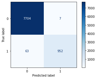
tip: use this link to change the color scheme of your confusion matrix: https://
# create classification report
from sklearn.metrics import classification_report

y_val_pred = neigh.predict(X_val)
print(classification_report(y_val_pred, y_val)) precision recall f1-score support
0 1.00 0.99 1.00 7767
1 0.94 0.99 0.96 959
accuracy 0.99 8726
macro avg 0.97 0.99 0.98 8726
weighted avg 0.99 0.99 0.99 8726
# we didn't get sensitivity and specificity, so we'll calculate that ourselves.
sensitivity = 943/(943+72)   # = TP/(TP+FN)
specificity = 7707/(7707+4)   # = TN/(TN+FP)
print(sensitivity, specificity)
0.929064039408867 0.9994812605368953
Selecting the correct ‘k’
How does “k” affect classification accuracy? Let’s create a function to calculate classification accuracy based on the number of “k.”
def chooseK(k, X_train, y_train, X_test, y_test):
    random.seed(1)
    print("calculating... ", k, "k")    # I'll include this so you can see the progress of the function as it runs
    class_knn = KNeighborsClassifier(n_neighbors=k)
    class_knn.fit(X_train, y_train)

    # calculate accuracy
    accu = class_knn.score(X_test, y_test)
    return accu
We’ll test odd k values from 1 to 21. We want to create a table of all the data, so we’ll use list comprehension to create the “accuracy” column.
remember: Python is end-exclusive; we want UP to 21 to we’ll have to extend the end bound to include it
test = pd.DataFrame({'k':list(range(1,22,2)),
                     'accu':[chooseK(x, X_train, y_train, X_test, y_test) for x in list(range(1, 22, 2))]})
calculating... 1 k
calculating... 3 k
calculating... 5 k
calculating... 7 k
calculating... 9 k
calculating... 11 k
calculating... 13 k
calculating... 15 k
calculating... 17 k
calculating... 19 k
calculating... 21 k
testtest = test.sort_values(by=['accu'], ascending=False)
testFrom here, we see that the best value of k=1!
Let’s go through the code we wrote in a bit more detail, specifically regarding the DataFrame construction.
For reference, here’s the line of code we wrote:
test = pd.DataFrame({'k':list(range(1,22,2)),
                     'accu':[chooseK(x, X_train, y_train, X_test, y_test) for x in list(range(1, 22, 2))]})
pandas DataFrames wrap around the Python dictionary data type, which is identifiable by the use of curly brackets ({}) and key-value pairs. The keys correspond to the column names (i.e. ‘k’ or ‘accu’) while the values are a list comprised of all the values we want to include.
For ‘k’, we made a list of the range of numbers from 1 to 22 (end exclusive), selecting only every other value. This is done using the syntax: range(first_val, end_val, by=?). Having no by= value means that we select every value in that range.
For ‘accu’, we used list comprehension, which boils down to being loop shorthand with the output being entered into a list. We could easily re-write the code as:
temp = []
for x in list(range(1, 22, 2)):
    temp.append(chooseK(x, X_train, y_train, X_test, y_test))
before adding the list to the DataFrame. Evidently, the list comprehension saves time and memory, which is why we used it earlier.
Now, let’s graph our results!
plt.plot(test['k'], test['accu'])
plt.xlabel('k')
plt.ylabel('Accuracy')
plt.title('Model Accuracy')
plt.show()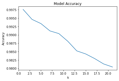
Adjusting the threshold
# we want to make a table containing: probability, expected, and actual values

test_probs = neigh.predict_proba(X_test)
test_preds = neigh.predict(X_test)
# convert probabilities to pd df
test_probabilities = pd.DataFrame(test_probs, columns = ['not_signed_up_prob', 'signed_up_prob'])
test_probabilitiesfinal_model = pd.DataFrame({'actual_class': y_test.tolist(),
'pred_class': test_preds.tolist(),
'pred_prob': [test_probabilities['signed_up_prob'][i] if test_preds[i]==1 else test_probabilities['not_signed_up_prob'][i] for i in range(len(test_preds))]})
# that last line is some list comprehension -- to understand that here in particular click the following link:
# https://stackoverflow.com/questions/4260280/if-else-in-a-list-comprehensionfinal_model.head()# add a column about the probability the observation is in the positive class
final_model['pos_pred'] = [final_model.pred_prob[i] if final_model.pred_class[i]==1 else 1-final_model.pred_prob[i] for i in range(len(final_model.pred_class))]final_model.head()# convert classes to categories
final_model.actual_class = final_model.actual_class.astype('category')
final_model.pred_class = final_model.pred_class.astype('category')# create probability distribution graph
import seaborn as sns
sns.displot(final_model, x="pos_pred", kind="kde")<seaborn.axisgrid.FacetGrid at 0x7fd178cb5c70>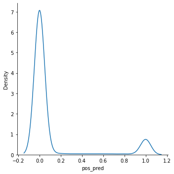
final_model.pos_pred.value_counts()0.000000 7563
1.000000 799
0.111111 91
0.222222 49
0.555556 40
0.333333 40
0.444444 38
0.777778 37
0.666667 37
0.888889 32
Name: pos_pred, dtype: int64In most datasets, the probabilities range between 0 and 1, causing uncertain predictions. A threshold must be set for where you consider the prediction to actually be a part of the positive class. Is a 60% certainty positive? How about 40%? This is where you have more control over your model’s classifications. This is especially useful for reducing incorrect classifications that you may have noticed in your confusion matrix.
from sklearn.metrics import confusion_matrix

def adjust_thres(x, y, z):
    """
    x=pred_probabilities
    y=threshold
    z=tune_outcome
    """
    thres = pd.DataFrame({'new_preds': [1 if i > y else 0 for i in x]})
    thres.new_preds = thres.new_preds.astype('category')
    con_mat = confusion_matrix(z, thres)
    print(con_mat)
confusion_matrix(final_model.actual_class, final_model.pred_class) # original modelarray([[7704, 7],
[ 77, 938]])adjust_thres(final_model.pos_pred, .90, final_model.actual_class) # raise threshold [[7711 0]
[ 216 799]]
adjust_thres(final_model.pos_pred, .3, final_model.actual_class) # lower threshold[[7664 47]
[ 39 976]]
More for next week: evaluation metrics
ROC/AUC curve
There are a few really cool graphing options, so I’ll show you a few. There are several packages in Python are interactive as well!
# basic graph
from sklearn import metrics

fpr, tpr, _ = metrics.roc_curve(y_test, final_model.pos_pred)
auc = metrics.roc_auc_score(y_test, final_model.pos_pred)
plt.plot(fpr,tpr,label="data 1, auc="+str(auc))
plt.legend(loc=4)
plt.show()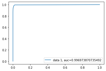
# installs dependency for next graph
! pip install plot_metric
Requirement already satisfied: plot_metric in /opt/anaconda3/lib/python3.8/site-packages (0.0.6)
Requirement already satisfied: scikit-learn>=0.21.2 in /opt/anaconda3/lib/python3.8/site-packages (from plot_metric) (0.24.1)
Requirement already satisfied: colorlover>=0.3.0 in /opt/anaconda3/lib/python3.8/site-packages (from plot_metric) (0.3.0)
Requirement already satisfied: matplotlib>=3.0.2 in /opt/anaconda3/lib/python3.8/site-packages (from plot_metric) (3.3.4)
Requirement already satisfied: seaborn>=0.9.0 in /opt/anaconda3/lib/python3.8/site-packages (from plot_metric) (0.11.1)
Requirement already satisfied: scipy>=1.1.0 in /opt/anaconda3/lib/python3.8/site-packages (from plot_metric) (1.6.2)
Requirement already satisfied: pandas>=0.23.4 in /opt/anaconda3/lib/python3.8/site-packages (from plot_metric) (1.2.4)
Requirement already satisfied: numpy>=1.15.4 in /opt/anaconda3/lib/python3.8/site-packages (from plot_metric) (1.20.1)
Requirement already satisfied: pyparsing!=2.0.4,!=2.1.2,!=2.1.6,>=2.0.3 in /opt/anaconda3/lib/python3.8/site-packages (from matplotlib>=3.0.2->plot_metric) (2.4.7)
Requirement already satisfied: cycler>=0.10 in /opt/anaconda3/lib/python3.8/site-packages (from matplotlib>=3.0.2->plot_metric) (0.10.0)
Requirement already satisfied: pillow>=6.2.0 in /opt/anaconda3/lib/python3.8/site-packages (from matplotlib>=3.0.2->plot_metric) (8.2.0)
Requirement already satisfied: kiwisolver>=1.0.1 in /opt/anaconda3/lib/python3.8/site-packages (from matplotlib>=3.0.2->plot_metric) (1.3.1)
Requirement already satisfied: python-dateutil>=2.1 in /opt/anaconda3/lib/python3.8/site-packages (from matplotlib>=3.0.2->plot_metric) (2.8.1)
Requirement already satisfied: six in /opt/anaconda3/lib/python3.8/site-packages (from cycler>=0.10->matplotlib>=3.0.2->plot_metric) (1.15.0)
Requirement already satisfied: pytz>=2017.3 in /opt/anaconda3/lib/python3.8/site-packages (from pandas>=0.23.4->plot_metric) (2021.1)
Requirement already satisfied: threadpoolctl>=2.0.0 in /opt/anaconda3/lib/python3.8/site-packages (from scikit-learn>=0.21.2->plot_metric) (2.1.0)
Requirement already satisfied: joblib>=0.11 in /opt/anaconda3/lib/python3.8/site-packages (from scikit-learn>=0.21.2->plot_metric) (1.0.1)
# a pretty cool one

from plot_metric.functions import BinaryClassification

# Visualisation with plot_metric
bc = BinaryClassification(y_test, final_model.pred_class, labels=["0", "1"])

# Figures
plt.figure(figsize=(5,5))
bc.plot_roc_curve()
plt.show()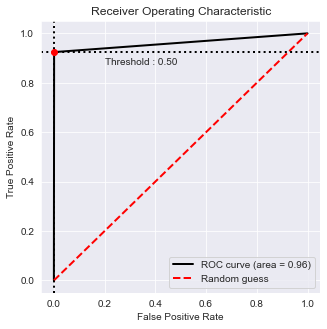
F1 score
metrics.f1_score(y_test, final_model.pred_class)0.9571428571428572LogLoss
metrics.log_loss(y_test, final_model.pred_class)0.3324848515189683Another quick example
from pydataset import data

iris = data("iris")
iris.info()
<class 'pandas.core.frame.DataFrame'>
Int64Index: 150 entries, 1 to 150
Data columns (total 5 columns):
# Column Non-Null Count Dtype
--- ------ -------------- -----
0 Sepal.Length 150 non-null float64
1 Sepal.Width 150 non-null float64
2 Petal.Length 150 non-null float64
3 Petal.Width 150 non-null float64
4 Species 150 non-null object
dtypes: float64(4), object(1)
memory usage: 7.0+ KB
iris.describe()from sklearn.preprocessing import scale
cols = list(iris.columns[:4])
scaledIris = pd.DataFrame(scale(iris.iloc[:, :4]), index=iris.index, columns=cols)scaledIris.info()<class 'pandas.core.frame.DataFrame'>
Int64Index: 150 entries, 1 to 150
Data columns (total 4 columns):
# Column Non-Null Count Dtype
--- ------ -------------- -----
0 Sepal.Length 150 non-null float64
1 Sepal.Width 150 non-null float64
2 Petal.Length 150 non-null float64
3 Petal.Width 150 non-null float64
dtypes: float64(4)
memory usage: 5.9 KB
scaledIris['Species'] = iris['Species']# split datasets
irisTrain, irisTest = train_test_split(scaledIris, test_size=0.4, stratify = scaledIris['Species'])
irisTest, irisVal = train_test_split(irisTest, test_size=0.5, stratify = irisTest['Species'])Xi_train = irisTrain.drop(['Species'], axis=1)
yi_train = irisTrain['Species']
Xi_test = irisTest.drop(['Species'], axis=1)
yi_test = irisTest['Species']
Xi_val = irisVal.drop(['Species'], axis=1)
yi_val = irisVal['Species']iris_neigh = KNeighborsClassifier(n_neighbors=3)
iris_neigh.fit(Xi_train, yi_train)KNeighborsClassifier(n_neighbors=3)iris_neigh.score(Xi_test, yi_test)0.9666666666666667iris_neigh.score(Xi_val, yi_val)0.9plot_confusion_matrix(iris_neigh, Xi_val, yi_val, cmap='Blues')
plt.show()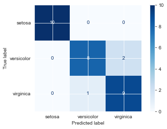
Example using 10-k cross-validation
from sklearn.model_selection import RepeatedKFold

rkf = RepeatedKFold(n_splits=10, n_repeats=3, random_state=12)

X_si = scaledIris.drop(['Species'], axis=1)
y_si = scaledIris['Species']
from sklearn.model_selection import cross_val_score
from sklearn.model_selection import GridSearchCV
cv_neigh = KNeighborsClassifier(n_neighbors=3) # create classifier
scores = cross_val_score(cv_neigh, X_si, y_si, scoring='accuracy', cv=rkf, n_jobs=-1) # do repeated cv
print('Accuracy: %.3f (%.3f)' % (scores.mean(), scores.std()))Accuracy: 0.949 (0.061)
plt.plot(scores)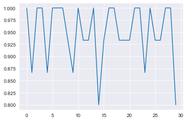
# more complex version so you can create a graph for testing and training accuracy (not built into the previous version)
#Split arrays or matrices into train and test subsets
Xsi_train, Xsi_test, ysi_train, ysi_test = train_test_split(X_si, y_si, test_size=0.20)
rcv_knn = KNeighborsClassifier(n_neighbors=6)
rcv_knn.fit(Xsi_train, ysi_train)
print("Preliminary model score:")
print(rcv_knn.score(Xsi_test, ysi_test))
no_neighbors = np.arange(1, 9)
train_accuracy = np.empty(len(no_neighbors))
test_accuracy = np.empty(len(no_neighbors))
for i, k in enumerate(no_neighbors):
# We instantiate the classifier
rcv_knn = KNeighborsClassifier(n_neighbors=k)
# Fit the classifier to the training data
rcv_knn.fit(Xsi_train, ysi_train)
# Compute accuracy on the training set
train_accuracy[i] = rcv_knn.score(Xsi_train, ysi_train)
# Compute accuracy on the testing set
test_accuracy[i] = rcv_knn.score(Xsi_test, ysi_test)
# Visualization of k values vs accuracy
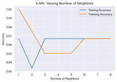
plt.title('k-NN: Varying Number of Neighbors')
plt.plot(no_neighbors, test_accuracy, label = 'Testing Accuracy')
plt.plot(no_neighbors, train_accuracy, label = 'Training Accuracy')
plt.legend()
plt.xlabel('Number of Neighbors')
plt.ylabel('Accuracy')
plt.show()Preliminary model score:
0.9666666666666667
Variable importance
There is no easy way in SKLearn to calculate variable importance for a KNN model. So, we’ll use a slightly hacked-together solution.
Variable importance reflects the significance one variable has on the model. If a variable is more important, that variable being removed/permuted has a larger effect on the output of the model. So, if we check the changes such permutations have, we should be able to extract the feature importance.
data = {'sepal_length': [0], 'sepal_width': [0], 'petal_length': [0], 'petal_width': [0]}
feat_imp = pd.DataFrame(data)
feat_imp.head()# baseline
fin_knn = KNeighborsClassifier(n_neighbors=7)
fin_knn.fit(Xsi_train, ysi_train)
print(fin_knn.score(Xsi_test, ysi_test))
plot_confusion_matrix(fin_knn, Xsi_test, ysi_test, cmap='Blues') 0.9666666666666667
<sklearn.metrics._plot.confusion_matrix.ConfusionMatrixDisplay at 0x7fd15b156a30>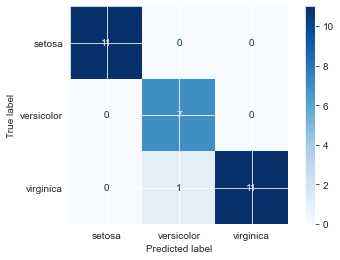
change Sepal.Length
Xsi_test.head()perm_SL = Xsi_test.copy() # # copy df; we don't want to alter the actual data
perm_SL['Sepal.Length'] = np.random.permutation(perm_SL['Sepal.Length']) # permute data
perm_SL.head()fin_knn.score(perm_SL, ysi_test)0.9feat_imp['sepal_length'] = fin_knn.score(Xsi_test, ysi_test) - fin_knn.score(perm_SL, ysi_test)
feat_imp.head()plot_confusion_matrix(fin_knn, perm_SL, ysi_test, cmap='Blues') # what got misclassified?<sklearn.metrics._plot.confusion_matrix.ConfusionMatrixDisplay at 0x7fd1687a73a0>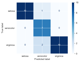
Instead of making this repetitive, we can turn this into a function and loop.
def featureImportance(X, y, model):
    # create dataframe of variables
    var_imp = pd.DataFrame(columns=list(X.columns))
    var_imp.loc[0] = 0
    base_score = model.score(X, y)
    for col in list(X.columns):
        temp = X.copy()   # # copy df; we don't want to alter the actual data
        temp[col] = np.random.permutation(temp[col])   # permute data
        var_imp[col] = base_score - model.score(temp, y)
        # plot_confusion_matrix(model, temp, y, cmap='Blues')  # what got misclassified?
    print(var_imp)
featureImportance(Xsi_test, ysi_test, fin_knn) Sepal.Length Sepal.Width Petal.Length Petal.Width
0 0.033333 0.0 0.4 0.266667
From here, we find the important variables!
General eval
plot_confusion_matrix(fin_knn, Xsi_test, ysi_test, cmap='Blues') <sklearn.metrics._plot.confusion_matrix.ConfusionMatrixDisplay at 0x7fe8f9c04b80>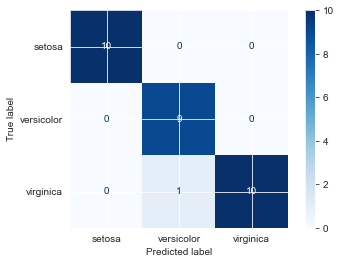
Looks like we only misclassified one virginica as versicolor. Let’s see how certain our predictions were.
iris2_probs = fin_knn.predict_proba(Xsi_test)
iris2_probs
array([[0. , 0.14285714, 0.85714286],
[0. , 0.28571429, 0.71428571],
[0. , 1. , 0. ],
[0. , 0. , 1. ],
[1. , 0. , 0. ],
[0. , 0.85714286, 0.14285714],
[0. , 1. , 0. ],
[0. , 0.28571429, 0.71428571],
[0. , 0.14285714, 0.85714286],
[0. , 0.28571429, 0.71428571],
[0. , 1. , 0. ],
[1. , 0. , 0. ],
[1. , 0. , 0. ],
[1. , 0. , 0. ],
[0. , 0. , 1. ],
[0. , 0.42857143, 0.57142857],
[0. , 0.71428571, 0.28571429],
[0. , 1. , 0. ],
[1. , 0. , 0. ],
[0. , 0.85714286, 0.14285714],
[1. , 0. , 0. ],
[0. , 1. , 0. ],
[0. , 0.85714286, 0.14285714],
[1. , 0. , 0. ],
[0. , 0. , 1. ],
[1. , 0. , 0. ],
[0. , 1. , 0. ],
[1. , 0. , 0. ],
[1. , 0. , 0. ],
[0. , 0. , 1. ]])